

UX Case Study


The “PlutoPay” app empowers parents to issue allowance to their children in a safe and secure way - giving their children the freedom to spend online, start learning to save and grow their financial independence.
Stephanie Edwards | November 2023

Project Details
Problem Statement
In an increasingly digital world, the common high street is struggling as more and more of our everyday purchases are made online. A side effect of this is parents discovering new barriers in managing and teaching their children about finances.
Possible Solution
An app which will support Parents to set up payments of allowance to their children on a regular basis, and see their spending history and saving goals, while also providing a space for those children to learn to manage their money.
April - Novemeber 2023
Timeline
UX Researcher
UX Designer
UI Designer
My Role
Figma
Usability Hub
Optimal Workshop
Google Forms
Canva
Tools Used
Design Process
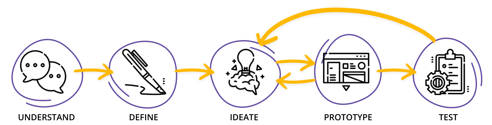

Understand & Define

The first step on our journey is understanding our audience and evaluating our competitors. Why should users choose us? What can we give them that our competitors can’t? UX Research helps us with understanding the problems and defining our proposed solution.
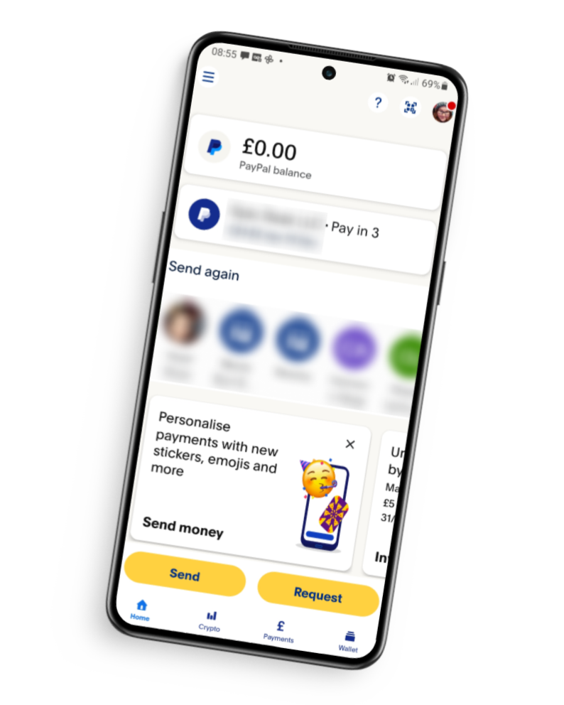
Competitive Analysis
The benefits of a competitive analysis are two fold, both allowing us to see what our competitors are bringing to the field, but also where their user experience is weak. As a leader in the online fiance world, I chose PayPal to take a look at, both to get inspiration be also to see what gaps we could fill.

Key Findings
There is no way currently to create a personal savings goal - only group pots for charity or some group cause.
Well integrated into many different payment processes making it easy to use across platforms
Navigation has an intuitive flow through CTA’s on the users dashboard, Should it be needed, there is a hamburger menu which is logically sorted and easy to use.
User Survey
With an understanding of the current landscape, I now wanted to get to know our potential audience so that I could be sure I was designing for real people with real problems. To achieve this, I ran a 10 question survey with 23 parents between the ages of 25 and 50.

9 of the 23 Parents said one of their biggest issues in managing allowance was knowing how much to give

70%
of parents expect their children to complete chores in return for allowance
Q: At what age would you start giving your child an allowance to spend on their own?

While there are some common ages, their is still a large age gap meaning our app needs to cater to a wide range of ages
User Interviews
The results from the user survey informed the questions asked in the interviews I held with 3 different potential users. I wanted to be able to dig deeper into some of my findings and give parents a chance to explain in their own words what they needed rather than being stuck to the survey bounds.
Goals
parents needs when it comes to supporting children’s learning about money management

UNDERSTAND
parents opinions on the gamification of money - what about rewards?

DETERMINE
the reason for giving allowance and what is most important to parents navigating this subject
PINPOINT
SAMPLE QUESTIONS
At current, what is your process for giving your child their allowance? How successful have you found this process? What are the challenges involved?
How do you feel about the idea of an app that incentives your child's good financial behavior, such as through rewards or gamification?
Can you tell me a little about the reasoning you had behind starting to give your child an allowance?


INSIGHTS

From the information gathered and seeing the problems my audience were having, I determined that a minimum viable product needed the following:
A way for parents to add funds into their account
A system for parents assigning chores to their children in return for money
A savings goal feature for children
A way to view spending history

Ideate & Prototype
Now we need to put this information to use, creating a snap shot of who we are designing for, what their common journeys through the app will be and roughly outlining what those journeys will look like on a screen!
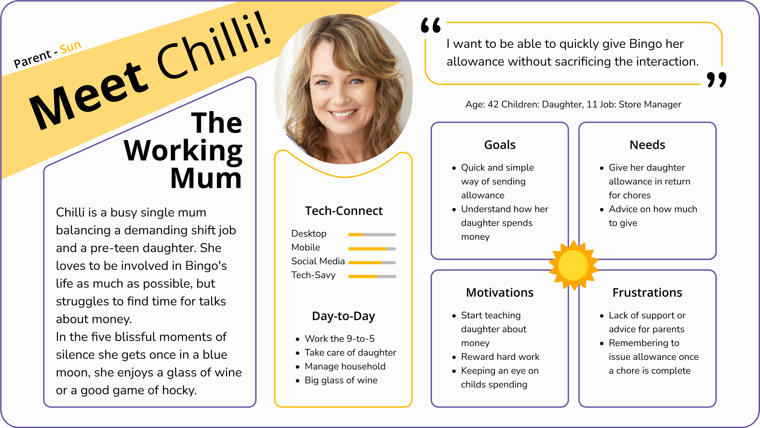
Personas
Persona’s help to give a face to our users. In meetings, rather than referring to the nebulous, we can connect with a person who represents the wants and frustrations of the people we are designing for, humanizing the process and allowing for effective design.
Chilli here is put together from the insights gained from both the User Surveys and User Interviews.
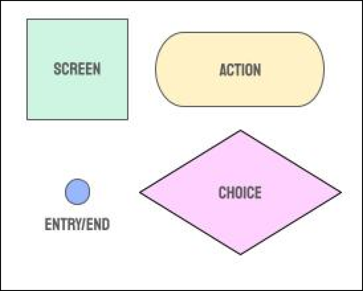
User Flows
A good user flow starts with a user story what does Chilli need to do and how will she know when it’s done? Keeping this story in mind we can then conduct a Task Analysis, breaking down each step Chilli will need to make to reach her goal. This helps to build the user flow, ensuring that no screen is forgotten when it comes to designing.

As a busy mum, I want to be able to assign chores to my daughter, so I can quickly send her allowance when they are complete.
CHILLI’S USER STORY
INFORMATION GATHERING
What is it that’s prompted my persona to begin the task?
Chilli is prompted to start this task as she wants to start giving her daughter an allowance easily
What will tell the persona that their task is finished?
Chilli will know her task is complete when she can see her daughter has outstanding chores
What information does the persona already know about the process?
Chilli knows what chores she wants her daughter to do
What additional information does the persona need to know to complete the task?
Chilli wants to know how much to give per chore but that is a nice to have
Finally, what tools will the persona need to complete the task?
Chilli will need our app only
Entry Point: Download the app
Success criteria: Daughter has chores to complete in her account
TASK ANALYSIS
Make an account with PlutoPay
Login
Create child’s account
Find way to add allowance
Select chore based allowance
Enter chores
Decide how much to pay for each chore
Assign monetary value
Save allowance plan

Wireframes
Once each of the user journeys were mapped out, I turned my hand to sketching out some rough designs to turn into wire-frames which could be used to test the initial proposed solutions.
Sketches
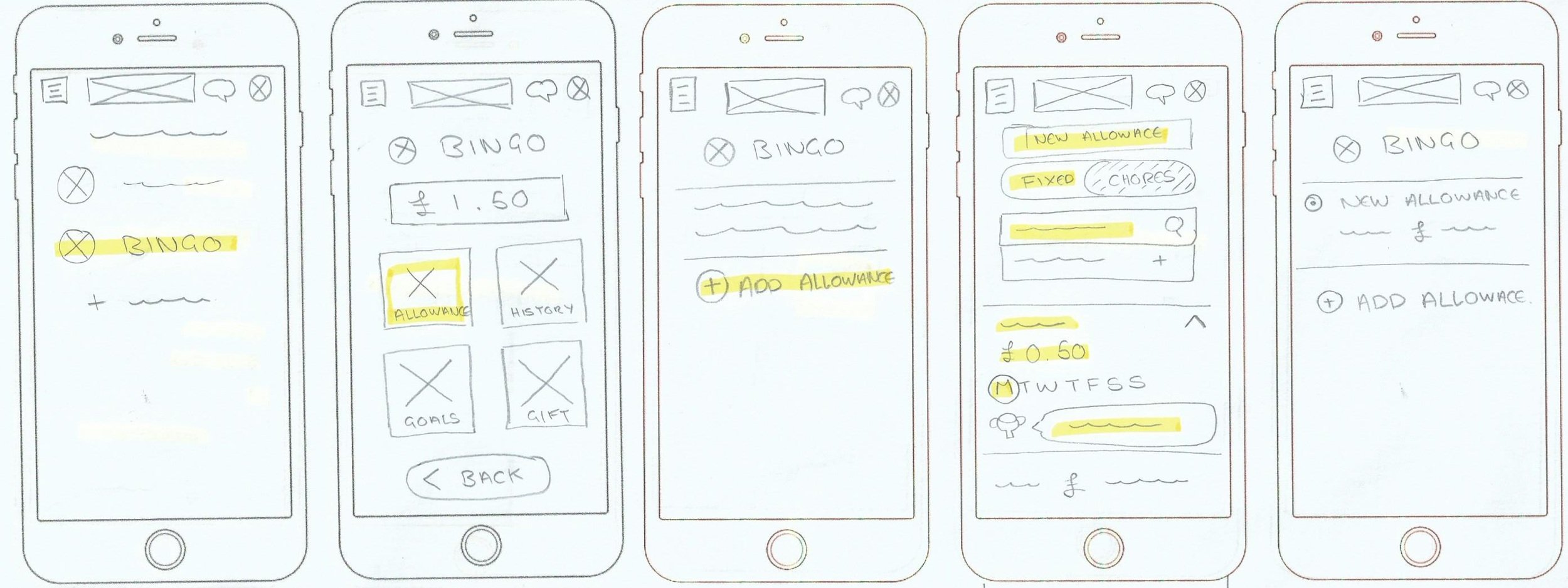
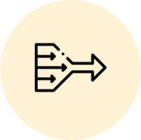
“My Kids” page. Here parents will be able to invite children to the app and click through to view their child’s account details and options.
Chilli taps on Bingo’s name and as they want to manage her allowance they tap “allowance”
From here, they can see different allowance plans they have set up on the app. They want a new one so tap “Add Allowance”
Parents can select fixed or chore based allowance. Clicking to select chores they can search a chore to add, edit the details, see the total of all the chores combined and save or cancel the plan.
Saving returns them to Bingo’s page where they can select the plan using a radio button.

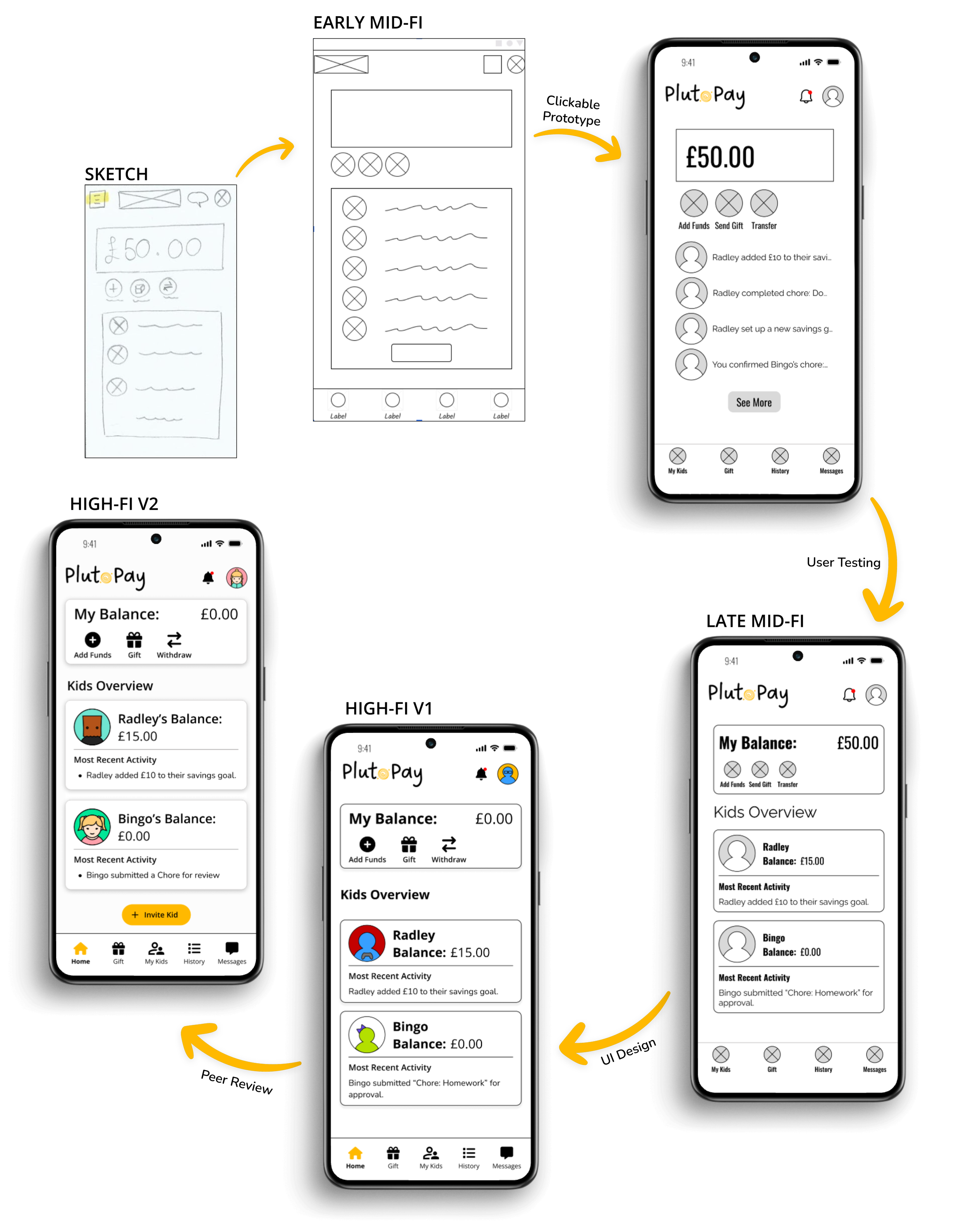
Mid-Fidelity

Test & Iterate

User Testing
Over the course of a week, I got 3 parents and 2 fellow designers to partake in a usability test with my mocked up wire-frames. With a range of experience between them, the feedback I got was surprisingly cohesive in some places and insight-fully unique in others. To sort through the data, I turned to the rainbow spread sheet technique to bring clarity to my next steps allowing me to update wire-frames before applying the gloss of UI.
Key Takeaways


AMPLIFY
the information quickly available to parents about their child's activity
CLARIFY
next steps in processes and navigation options
SIMPLIFY
the options available for a smooth and seamless journey
Changes
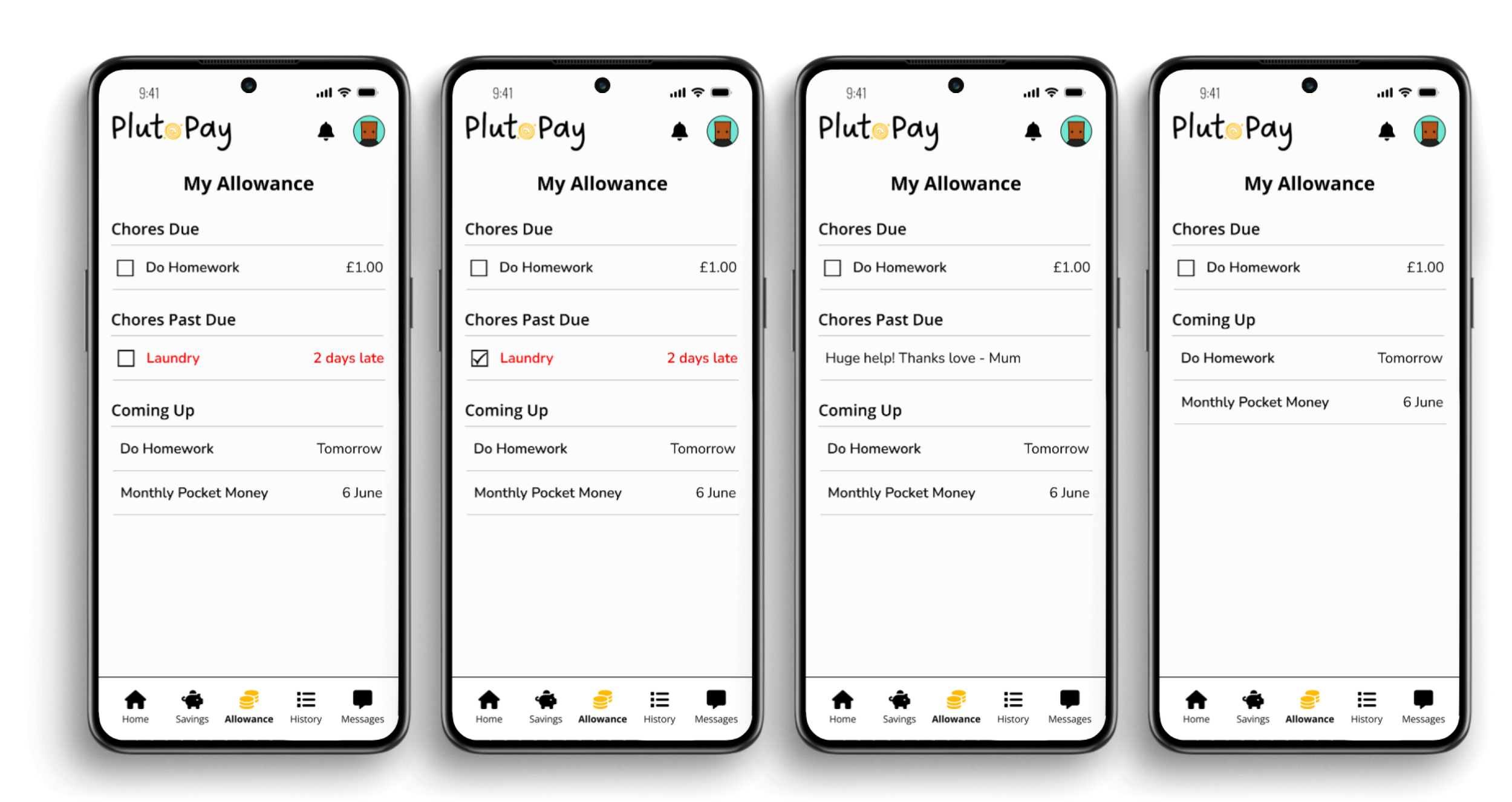
One of the larger issues raised in the user testing was surrounding the allowance process and with this being a USP on the project it was a priority to sort. What it boiled down to was the process being too complex, saving chores into a plan and then selecting a plan for the child. Getting rid of the plan and just having parents add chores and fixed sums to each child directly streamlines the process and removes the uncertainty.
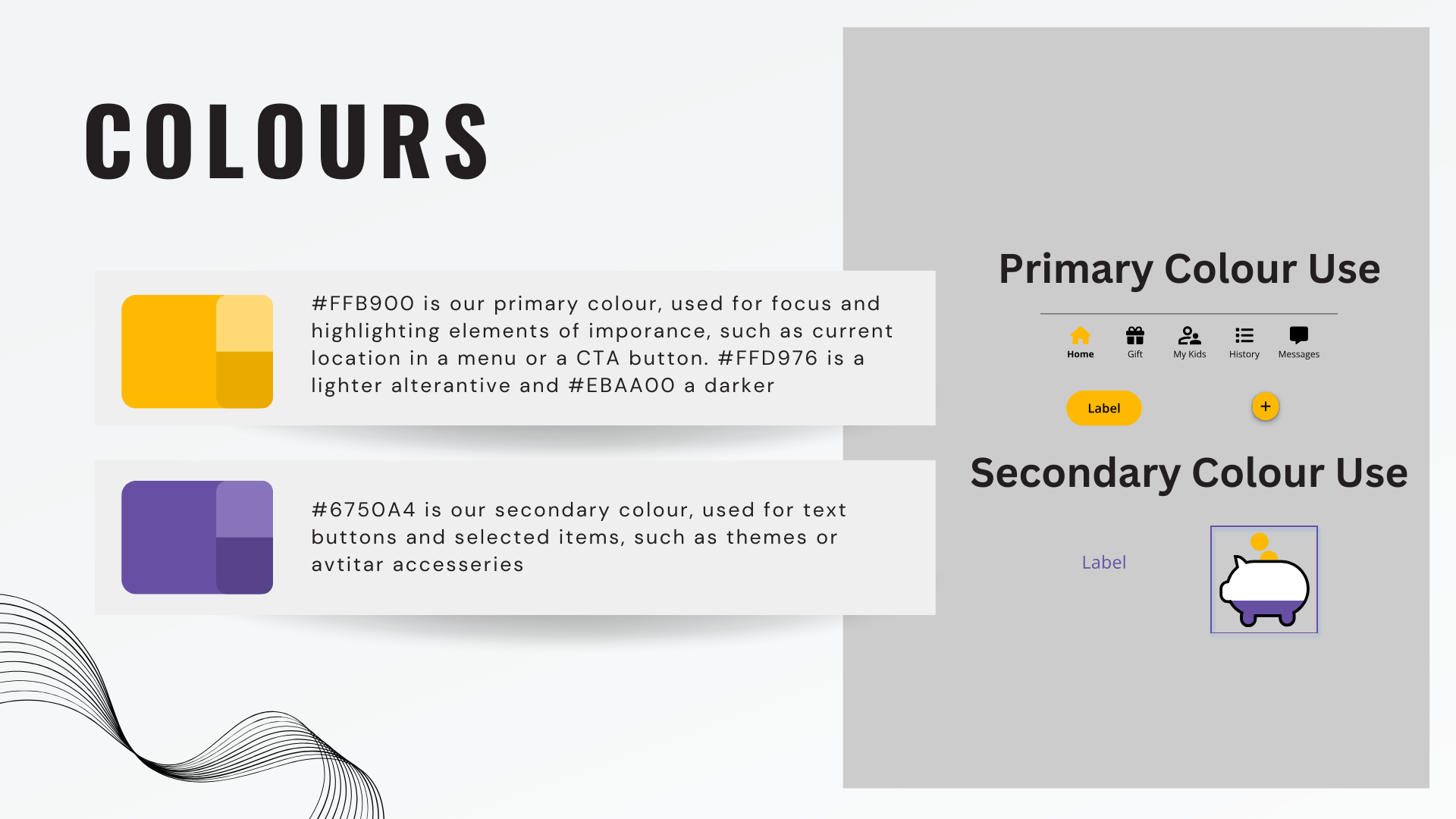
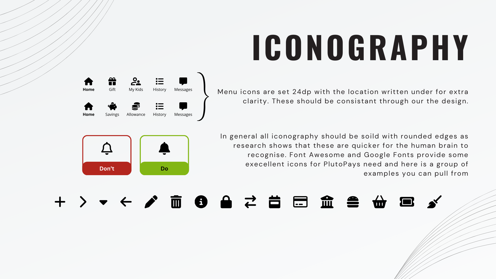
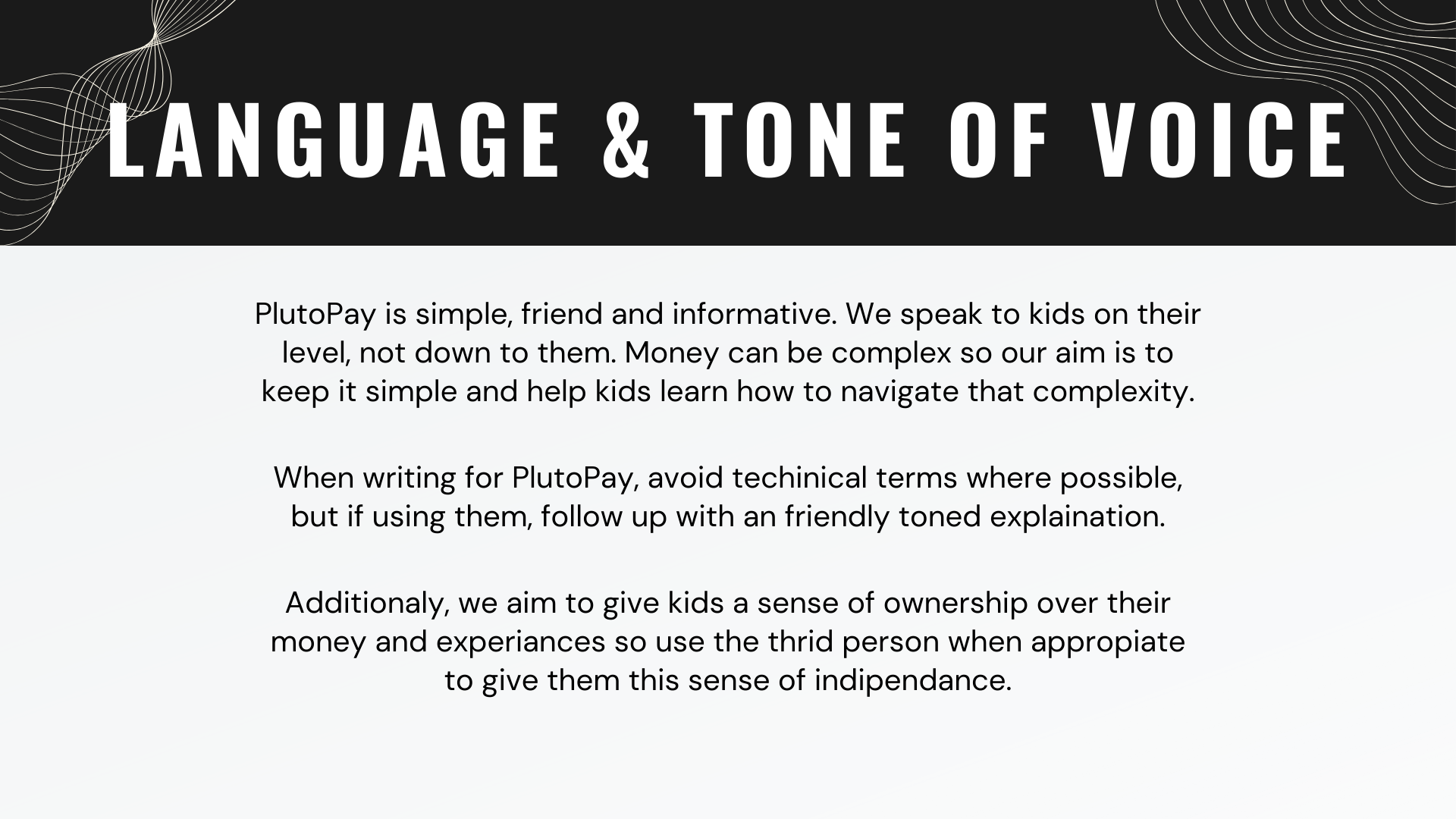
UI Design System
In order to ensure consistency in the design over the products life time, it is important to compile a design system while working on the design of the High-Fidelity screens.


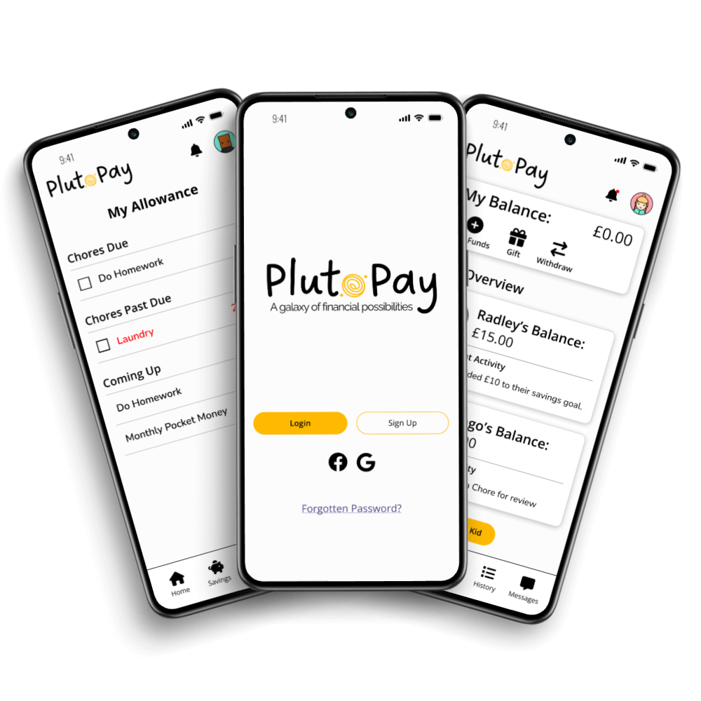
Mock-Ups
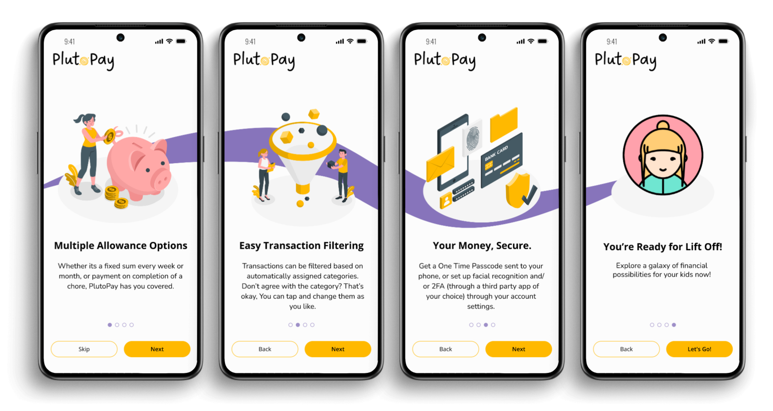
Parent Onboarding
Child Chore Complete

Chore Payout

Dashboard Iterations
Video Demo
Project Reflection
PlutoPay has been a project close to my heart but it has had its fair share of learning experiences. What to do when you get opposing feed back, how to translate ideas that look good on paper, but that are too complex in reality, into workable solutions and how to defend my design decisions when they go against the grain.
This project has given me a solid foundation on which to continue growing my User Experience Design prowess and is the first iteration of my skills on show.
Learnings
This project covers the Minimum Viable Product for PlutoPay and there are features waiting in the wings to be added in. A “Gift” feature which allows Dad ‘Bandit’ to brake down the £100 birthday present into more reasonable monthly payment of £20 to Radley. The ability for Chilli to say that she no longer needs to confirm Bingo’s chores are complete before Bingo gets her hard earned cash.
No project is ever truly complete, designs get iterated and new features help users as new problems arise. PlutoPay has the ability to grow as it’s users needs do.